The Case Against…
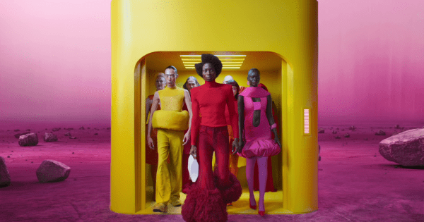
“It’s a departure with no connection to Jaguar’s legacy”
Anjela Freyja, creative director of design & brand, Joan
“Jaguar has walked away from almost a century of established brand equity—a risky move for a company already facing significant challenges. The new direction seems designed to capture a Volkswagen-like audience with visual cues towards The Jetsons and The Hunger Games. It’s a departure with no connection to the brand’s legacy.
“This is what is most disappointing about this rebrand: its disregard for its rich history. A history that provided Jaguar with a strong and alluring brand world. And while it may not have fully resonated with today’s audience, it had immense potential to evolve for a more electric, modern, and mass audience.
“That is the rebrand I would’ve loved to see.”
‘It’s more ’70s Star Trek,’ than Jaguar’
Claire Parker, group creative partner, The Chase
“Oh dear, I’m well and truly in the ‘against’ camp. When I first saw the redesigned growler and the mixed-case typography, it felt like an ad for Tropicana. Instead of embodying modern luxury, the identity feels inconsistent—hesitant, even—a far cry from Jaguar’s traditionally bold confidence.
“The backlash stems from this disconnect. The rebrand’s experimental typography and overly modernized leaper lack the timeless sophistication needed for such a leap. I’m all for change, but it should be rooted in the truth and personality of the brand.
“I would have leaned into Jaguar’s legacy, blending its classic design cues with understated touches to signify the future. Minimal yet meaningful updates could have highlighted Jaguar’s unique point of difference while maintaining its identity.