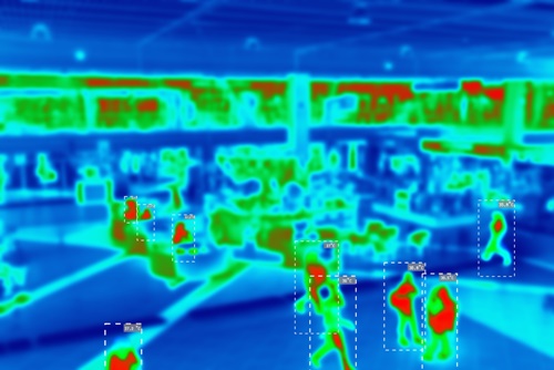
In the digital realm, every click, every scroll, and every moment of hesitation tells a story. But how do businesses truly understand these silent narratives? The answer lies in heatmaps – the colorful X-ray pictures of your website or app that reveal exactly where your customers click, scroll, and even look. Imagine having the power to see your website through your customers’ eyes, understanding what truly grabs their attention and what falls flat. This is the magic of heatmaps, a powerful tool for optimizing user experience and boosting conversions.
At its core, a heatmap is a visual representation of user activity. Different colors indicate varying levels of interaction, much like a weather map shows temperature variations. “Hot” colors (like red and orange) signify areas of high engagement, while “cooler” colors (like blue and green) indicate less interaction. This intuitive visual feedback allows businesses to quickly identify popular content, overlooked sections, and even areas of confusion.
Types of Heatmaps:
There are several types of heatmaps, each offering unique insights:
- Click Heatmaps: These are the most common, showing where users click on a page. They reveal which buttons are most popular, which links are being ignored, and if users are clicking on non-clickable elements, indicating design confusion.
- Scroll Heatmaps: These illustrate how far down a page users scroll. They help identify if critical information is placed “above the fold” (visible without scrolling) and if users are engaging with content further down the page. If a significant drop-off occurs early on, it might signal a need to re-evaluate content structure or placement.
- Move Heatmaps (Hover Maps): These track mouse movements, often correlating with eye-tracking. While not a direct substitute for eye-tracking, they can provide a good indication of where users are looking and what elements are drawing their attention, even if they don’t click.
- Attention Heatmaps: Some advanced tools can even estimate areas of “attention” based on a combination of clicks, scrolls, and mouse movements, providing a more holistic view of user engagement.
Why are Heatmaps Indispensable for Your Business?
Heatmaps provide actionable insights that traditional analytics often miss. While Google Analytics tells you what happened (e.g., number of page views, bounce rate), heatmaps tell you why it happened.
- Optimize Website Design: Identify confusing layouts, ineffective calls to action (CTAs), and areas where users get stuck.
- Improve Content Placement: Understand which content resonates most with your audience and where to place your most important messages.
- Boost Conversion Rates: By identifying and fixing friction points, businesses can streamline the user journey and encourage more conversions, whether it’s a purchase, a form submission, or a signup.
- Enhance User Experience (UX): Create a more intuitive and enjoyable experience for your visitors, leading to higher satisfaction and repeat visits.
- A/B Testing Insights: Use heatmap data to inform your A/B test hypotheses, making your experiments more targeted and effective.
Tools of the Trade: Crazy Egg and Beyond
Tools like Crazy Egg are at the forefront of heatmap technology, offering a user-friendly interface to gather and analyze these invaluable insights. Beyond Crazy Egg, other popular options include Hotjar, Mouseflow, and FullStory, each with its own set of features and specialties. These platforms typically offer a simple installation process, allowing businesses to start collecting data quickly.
Case Study 1: E-commerce Retailer Improves Product Page Conversion
A mid-sized online clothing retailer was experiencing a lower-than-desired conversion rate on their product pages. They suspected that customers weren’t finding the information they needed or that the “Add to Cart” button wasn’t prominent enough. Using a click heatmap tool, they discovered a surprising insight: a significant number of clicks were occurring on the product image itself, even though it wasn’t clickable for a larger view. Furthermore, the “Add to Cart” button, while above the fold, was blended in with other elements.
Action Taken: They implemented a light-box feature for product images to allow for a larger view on click. They also redesigned the “Add to Cart” button, making it a contrasting color and slightly larger.
Result: Within two weeks, the product page conversion rate increased by 12%, demonstrating how a small design tweak, informed by heatmap data, could have a significant impact on sales.
Case Study 2: SaaS Company Streamlines Onboarding Flow
A Software-as-a-Service (SaaS) company noticed a high drop-off rate during their user onboarding process. They used scroll heatmaps to understand where users were abandoning the setup steps. The heatmaps revealed that users were consistently dropping off after a specific section that explained advanced features. It appeared to be overwhelming for new users who were still trying to grasp the basics.
Action Taken: They redesigned the onboarding flow, moving the advanced features explanation to a later stage or providing it as an optional resource. They focused the initial steps on core functionalities, making the process simpler and more manageable.
Result: The user completion rate for the onboarding process improved by 18%, leading to more active users and reduced churn in the long run.
Conclusion:
Heatmaps are no longer a niche tool; they are a fundamental component of any robust digital marketing and optimization strategy. By providing a clear, visual understanding of user behavior, they empower businesses to make data-driven decisions that lead to more engaging websites, happier customers, and ultimately, a healthier bottom line. If you’re looking to truly understand your online audience and unlock your website’s full potential, it’s time to embrace the colorful world of heatmaps.
The post Heatmaps To See Where Customers Click And Shop appeared first on Maction.